The most useful accessibility testing tools and techniques
Shipping accessible features is as essential for a frontend developer as shipping features without bugs. Here is a list of tools I regularly use to make sure everything I do is accessible for folks with different abilities, whether they are blind or holding a sandwich in their hand. I’ll start with tools that will give us immediate feedback when we’re writing code, and continue with tools that we have to run ourselves or guide us on how to test things manually. This article will be useful not only for developers but also for designers, project managers, and other team members — many of the tools could be used directly in the browser and don’t require any technical knowledge.
Getting started with accessibility testing
If you haven’t done accessibility testing before or you’ve got a project that’s build without accessibility in mind, I’d recommend to start with the following steps to assess the project’s accessibility and start improving it:
- (For React projects) Install the React ESLint plugin, and fix all reported issues.
- Run FastPass in the Accessibility Insights browser extension to find two most common accessibility issues, and fix them.
- Tab through the site or app with a keyboard to test keyboard navigation and focus states.
This won’t make your site or app fully accessible but it’s a good first step in that direction. We’ll talk about each tool and technique in more detail in the rest of the article.
React ESLint plugin
I like it when someone tells me when I’m doing something wrong as soon as possible without asking myself. The linter is a perfect tool for that because it gives us immediate feedback when I’m writing code, right in the editor.
For React projects, eslint-plugin-jsx-a11y checks many accessibility issues, like missing alternative text on images or incorrect ARIA attributes and roles.

Unfortunately, this plugin is somewhat limited:
- static analysis of the code could only find few problems;
- it only works with plain HTML elements but doesn’t know anything about our custom components.
However, we’re likely already using ESLint on a project, so the cost of having this plugin is minimal, and occasionally it finds issues before we even look at our site or app in the browser.
Axe-core
Axe-core is a library that checks the accessibility of the rendered HTML in the browser. This is more powerful than static code analysis, like ESLint, because it can find more problems, like checking if the text has sufficient color contrast.
There are many tools based on axe-core.
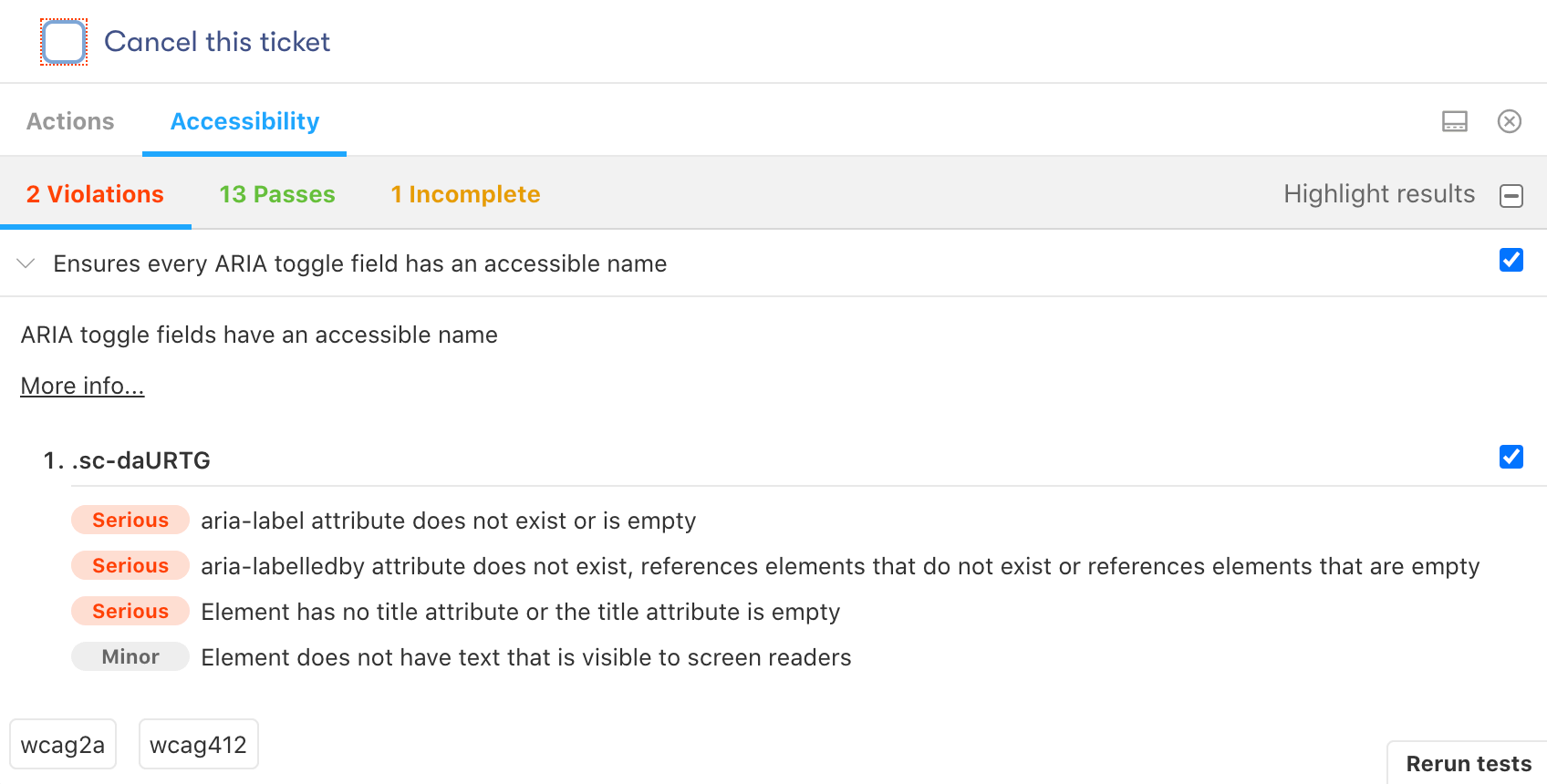
For Storybook, there’s a a11y addon:
For React Styleguidist, we could add react-axe manually:
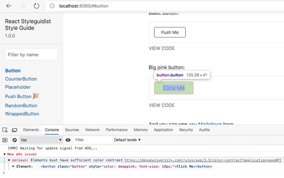
Both don’t check things like the document outline or landmark regions, which would require rendering a complete page. However, we could have quick feedback when we develop new components in isolation. We could check each component variant’s accessibility, which is hard to do using the actual site or app.
Cypress-axe
Unless we test our site or app’s accessibility after every change, we’ll eventually introduce regressions. That’s why it’s essential to make accessibility testing a part of the continuous integration (CI) process. We should never merge the code to the codebase without testing its accessibility.
Cypress-axe is based on axe-core. It allows us to run accessibility checks inside end-to-end Cypress tests, which is good because we likely already run end-to-end tests during continuous integration, and we render all our pages there. We could also run checks multiple times to test pages in different states. For example, with an open modal or an expanded content section.

Such tests could be a good accessibility smoke test that makes sure we’re not breaking our site or app. However, cypress-axe is inconvenient to analyze pages that already have accessibility issues. For that, a browser extension, like Axe or Accessibility Insights, would be more convenient.
Read more about setting up and using cypress-axe.
Tip For automated accessibility testing of separate components, jest-axe could be a good option.
Axe browser extension
Axe browser extension for Chrome and Firefox is based on axe-core. However, we run this extension on an actual site or app, so it could find issues that are impossible to find by checking a single component, like correct headings structure or landmark regions.
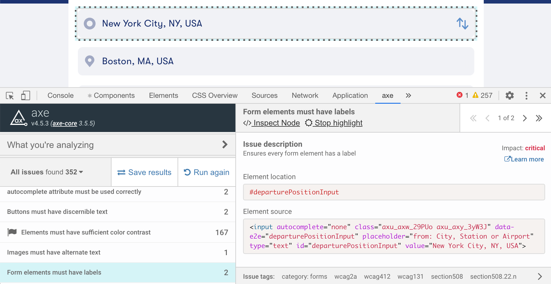
This extension is great to do an accessibility audit but we have to remember to run it every time we add or change something on our site or app. Sometimes, it has false negatives, for example, when Axe can’t determine the background color and reports text as having insufficient color contrast.
Accessibility Insights browser extension
Microsoft’s Accessibility Insights browser extension is also based on axe-core but has a few unique features.
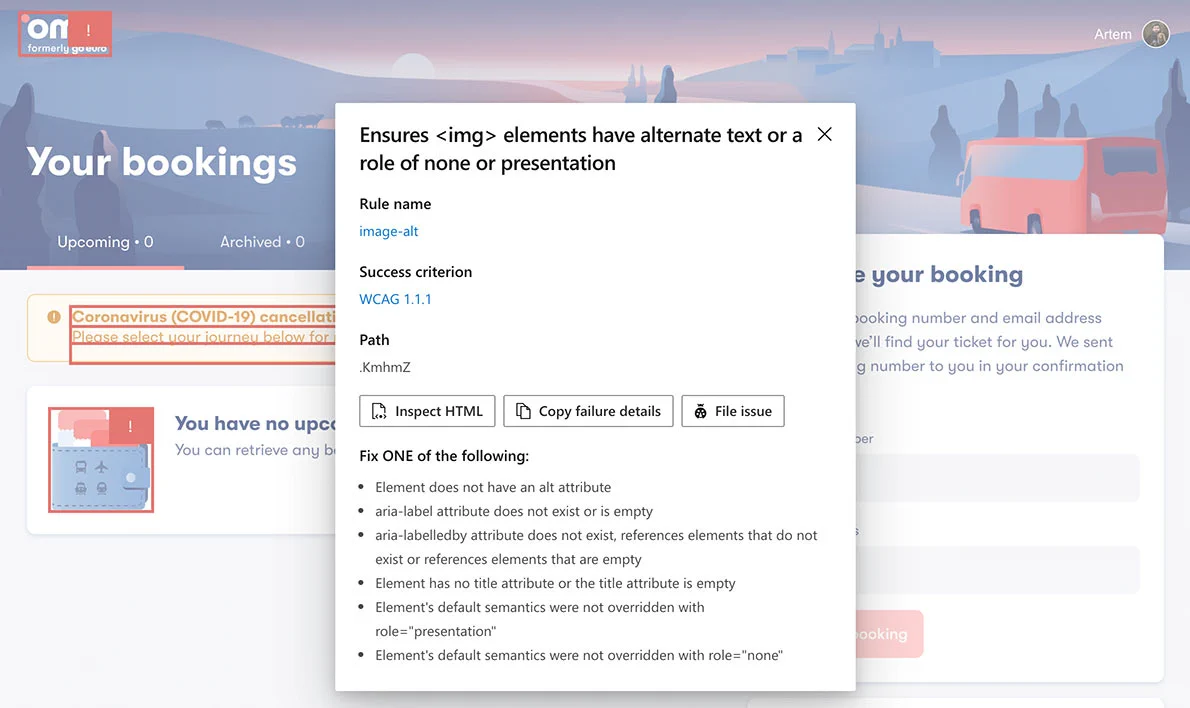
Accessibility Insights has automated checks similar to the Axe extension, but it also highlights all the issues directly on a page:
Accessibility Insights also has instructions for many manual checks that can’t be automated:
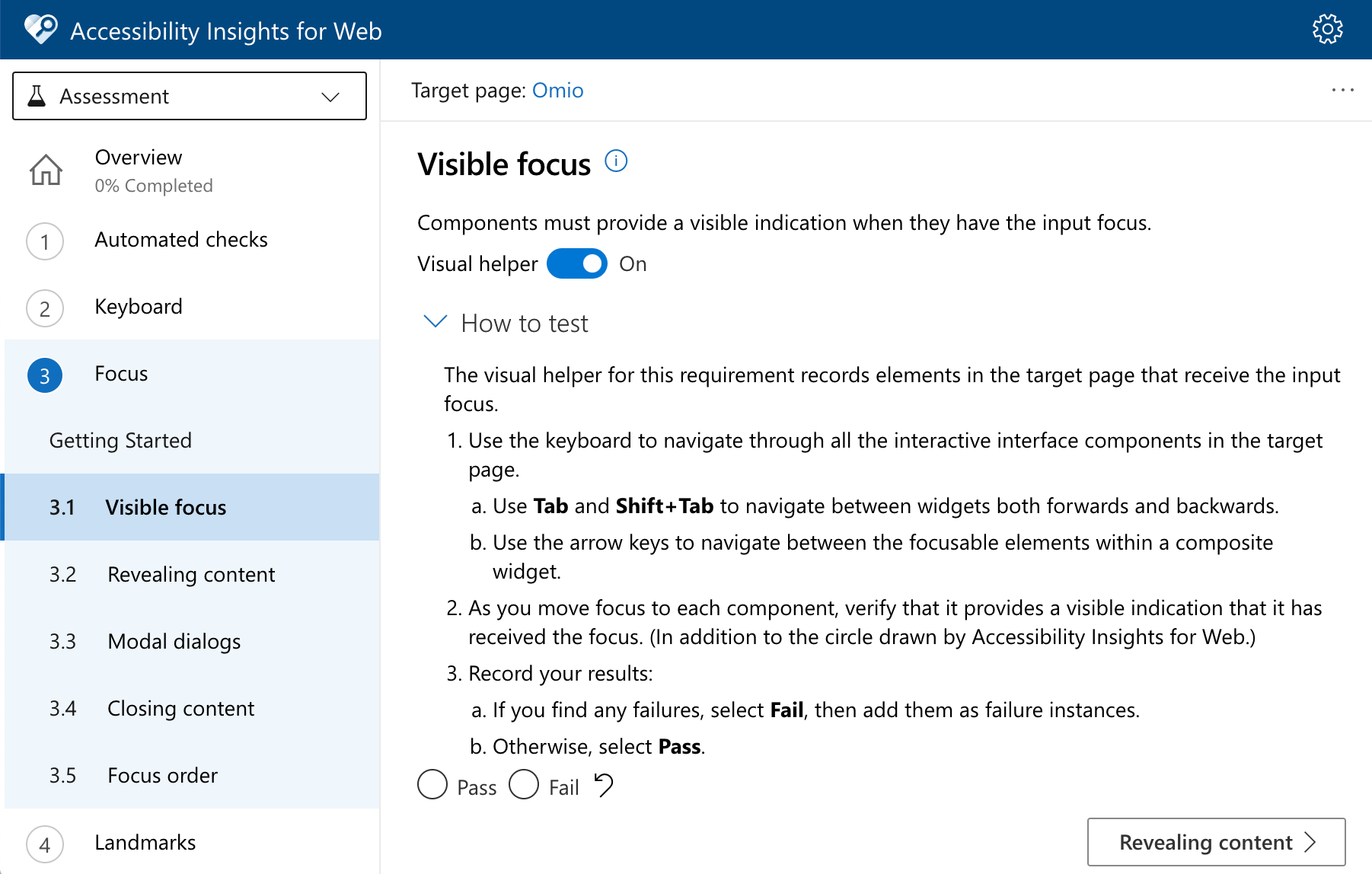
The FastPass feature finds two most common accessibility issues, and is a good first step in improving site or app’s accessibility.
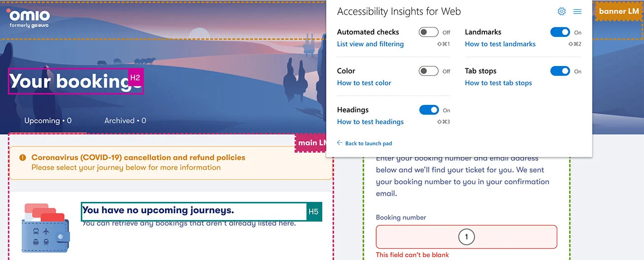
Finally, it could highlight headings, landmark regions, and tab stops (see “Tab key” below) on a page:
Contrast app and Chrome DevTools contrast checker
Sometimes we need to check the color contrast on a mockup or somewhere else, where running a browser extension is inconvenient or impossible.
To check color contrast in the browser, Chrome DevTools contrast checker is a good option (inspect an element, and click a color swatch in the Styles tab):
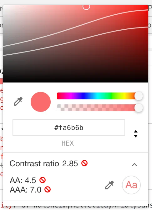
For all other cases, use Contrast app, and pick any two colors using an eyedropper:

Bonus Contrast ratio web app by Lea Verou is another option when you want to share a link with the check results.
Spectrum Chrome extension
Spectrum browser extension allows us to check how folks with different types of color blindness see our site or app, and make sure there’s enough contrast between different elements.
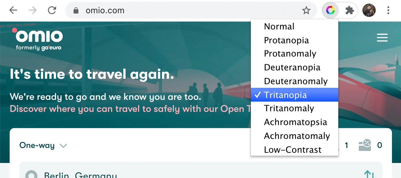
Update May 2024 Looks like Spectrum extension is no longer available. Colorblindly seems to be a good replacement.
Bonus Chrome DevTools can emulate some of these vision deficiencies. Press Escape, enable the Rendering tab from the three-dot menu button and scroll to the Emulate vision deficiencies section.
Tab key
By tabbing through the app, meaning pressing the Tab key on the keyboard to navigate between interactive elements on the page, we can check that:
-
all interactive elements are focusable and have a visible focus state;
-
the tab order should make sense; usually, it should follow the visual order of elements on the page;
-
the focus should be trapped inside modals, meaning we shouldn’t be able to tab back to the page behind the modal until we close it, and once we close the modal, the focus should go back to the element that opened the modal;
-
skip navigation link should appear when we press the Tab key for the first time:

Along with the Tab key, it’s worth checking that other keys work as expected: for example, we can navigate lists using arrow keys, or some validation code doesn’t block arrows and Backspace in text fields.
We should be able to complete all important actions in our site or app without touching a mouse, trackpad, or touchscreen. At any time, we should know which element is in focus.
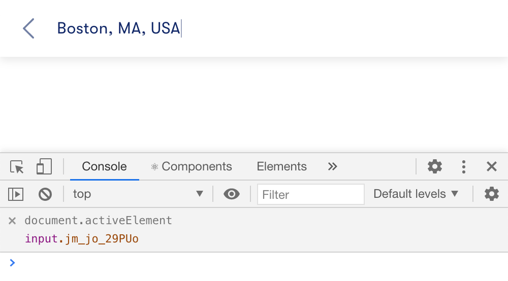
Tip I often use a live expression on document.activeElement in Chrome DevTools to see which element is in focus (“Create live expression” button in the Console tab’s toolbar). It helps to find elements without a visible focus state, or invisible elements that can be focused.
Bonus No Mouse Days npm package by Marcy Sutton disables the mouse cursor to encourage better keyboard support in a site or app.
Zoom
By zooming in our site or app, we can check how it handles, well, zooming. Try to zoom in to 200% in the browser, and see what breaks. Many people (myself included) zoom in when the text is too small for them, so we should make sure that the layout isn’t breaking, the text isn’t cropped, and elements aren’t overlapping each other.

Tip Using rems for all sizes in CSS, including media query breakpoints, is usually enough to avoid problems with zooming.
Screen reader
By using our site or app with a screen reader, we can check that:
- all interactive elements are focusable and have accessible labels;
- tab order, semantic markup, and textual content make sense;
- the skip navigation link brings us directly to the main page content, so we don’t have to listen through all navigation links again and again.
Testing with a screen reader is in many ways similar to testing with a keyboard. Since we can’t see the screen (and I’d recommend turning it off or closing your eyes during testing), we can’t use a mouse or a trackpad to select items on a page, we can only tab to them with a keyboard. The main difference is that we can’t recognize elements like buttons by their look, or can’t connect form inputs with labels by their location. We should define these relationships using semantic markup or ARIA attributes.
On macOS, we already have VoiceOver. On Windows, there are built-in Narrator, free NVDA, or paid JAWS. There’s also ChromeVox that we can install as a Chrome extension.
Tip To get started with VoiceOver, check out this article and keep this cheat sheet.
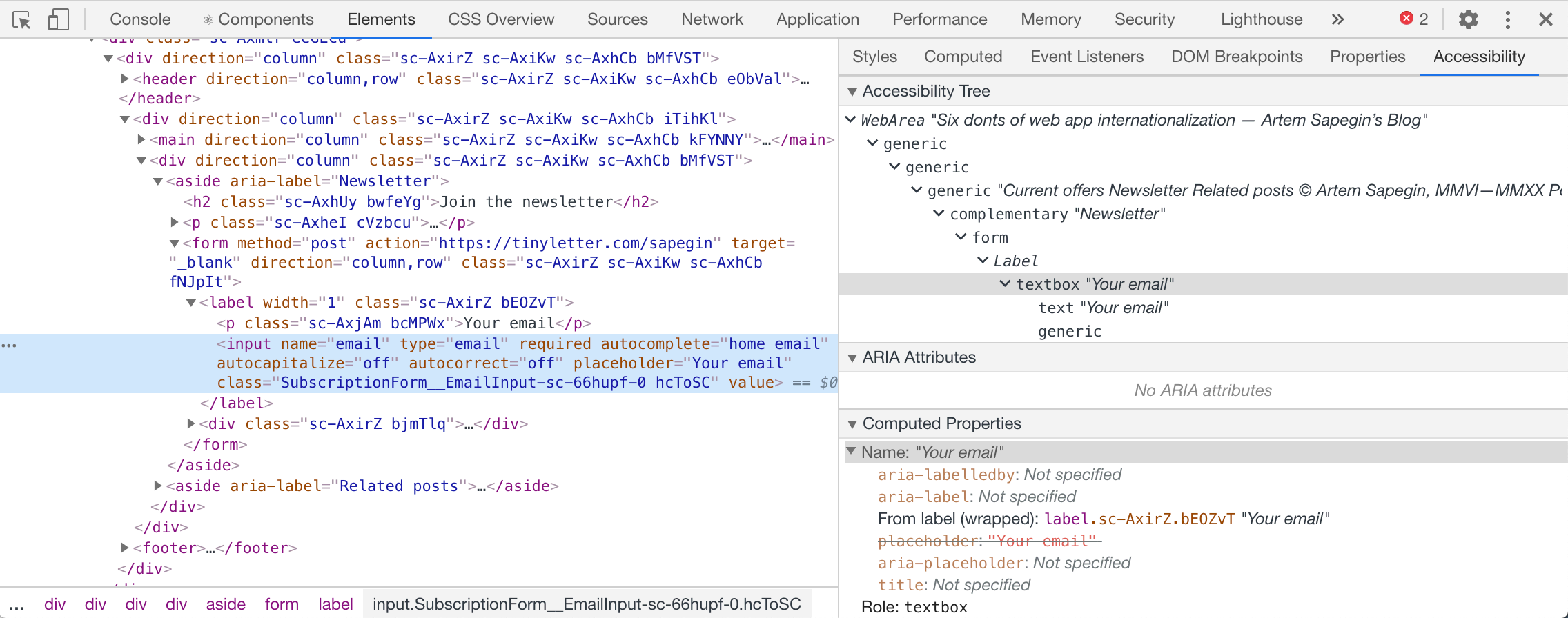
Bonus Use the Accessibility tab in Chrome DevTools to check how assisting technologies see a particular element:
There’s always more
A few more things that are worth testing:
-
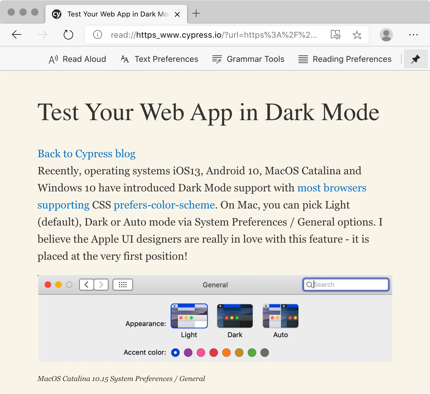
Browser reading mode is an accessibility tool itself: it helps readers concentrate on the main content, or make colors readable. We could also use it as a quick way to test the semantic markup of our pages: we should see the main page heading, complete main content, all content images but nothing extra like decorative images or banners.
-
Reduced motion is an operating system option that tells sites and apps (via
prefers-reduced-motionmedia query) that the user prefers to minimize non-essential motion on the screen. We could use it to disable animation on things like reveal on scroll or carousels. -
The dark mode could be a site or app option or an operating system option that we could read via
prefers-color-schememedia query. We should ensure that our site or app, especially colors, is still accessible in the dark mode. -
Hover alternatives for keyboard and touchscreens: hover shouldn’t be the only way to reveal some content or an interactive element. A common example is a menu that appears on hover on an item in a long list. A tooltip is another example. We could show these elements when the container is in focus for keyboard users, and always show them on touchscreens.
Tip Use CSS any-hover interaction media feature query to test hover support on the device — though beware of making incorrect assumptions.
Tip We could use Cypress and cypress-axe to test the accessibility of our site or app in the dark mode.
Resources
- Accessible to all
- Color contrast guide
- Accessibility for teams
- Web accessibility course by Google
- The a11y project accessibility checklist
- Writing HTML with accessibility in mind by Manuel Matuzovic
- Writing JavaScript with accessibility in mind by Manuel Matuzovic
- Writing CSS with accessibility in mind by Manuel Matuzovic
- Beyond automatic accessibility testing: 6 things I check on every website I build by Manuel Matuzovic
- Assistive technologies I test with by Dave Rupert
- Testing web accessibility by Adrián Bolonio
- 16 things to improve your website accessibility (checklist) by Bruce Lawson
- The business case for digital accessibility
- Getting Started with VoiceOver & Accessibility by Sue Lockwood
Conclusion
We’ve covered a lot of different tools and techniques, many of which I use not only to test my work but to be able to use some sites, like zooming in on a site with tiny fonts or using the reading mode on a site with a dark background.
Keep in mind that tools can only detect some issues, and we should find a balance between automated and manual accessibility testing.
Manual accessibility testing, when done right, allows us to find most of the problems. However, it’s time-consuming, and we have to redo it for every new feature of our site or app.
Automated accessibility testing is cheap to run, and it keeps the site or app from regressions. However, automated testing could only find certain types of issues.
Thanks to Eldar Amantay, Wendy Fox, Anna Gerus, Anita Kiss, Manuel Matuzovic, Patrick Smith.